Stephen Shore
Focus, pg. 113, essay by Joel Sternfeld. Phaidon 2007 ISBN 978-0-7148-4662-0
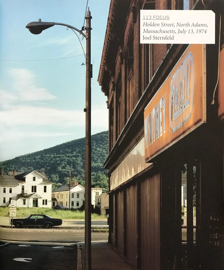
Stephen Shore's photograph of a summer morning settling in on Holden Street in North Adams, Massachusetts, appears to be a picture replete with dualities, the most obvious being that of town and countryside. The brick commercial buildings bookend a central panel of green hills and blue sky as if the entirety were an early Christian altarpiece. The most sacred panel, the centre one, contains an image of a deity, which in this secular case turns out to be a wooden building of pure white. The building stands in front of a mountain, a standard symbol of spiritual elevation.
In America, the deeply archetypal notion of the town (the Old Norse 'tun'), has been particularly resonant: 'Small Town America', 'Our Town' and 'Main Street' are all coded signifiers of Americanized virtue. However, at other times 'town' can signify a kind of gossipy Peyton Place where individual freedom may be nullified by group mores and neighborhood nosiness. Writing of Oak Park, Illinois, Ernest Hemingway described it as a place of 'wide lawns and narrow minds'. Several years after Shore made his sunlit picture, another artist, Gregory Crewdson, was repeatedly casting North Adams as a noir municipality where a darker reality waits in the bushes just beyond the white picket fence.
Regardless of which view of town is taken, when the town/country duality is made, town is portrayed as the dark urban merchant, evil in comparison to the bright virtues of Nature and rural living. Nothing trumps Nature - it is pure, it is good. Its mythic credentials run deeper than those of any old 'tun'.
Because Wilderness has not been touched by the hand of man, it provides a clean slate for the projection of idealized human attributes - or at least it did until the English critic John Ruskin came along in 1856 and referred to the personification of Nature as the 'Pathetic Fallacy’.
The town/country or civilization/wild duality takes form in this picture in the contrast between a Rexall Drug store, where the cures for urban ills can be purchased, and the green hills in the distance rising up to a blue sky that does not admit of any ills at all. At the base of the hill is a white building that resembles a small-scale Parthenon. Look carefully and you will see that the second-floor windows of this distant edifice are slightly smaller than those of the first, and that the third story windows are slightly smaller still, so that the eye is tricked into seeing a noble building of classical proportions without receding lines. The explanation for this mini-temple goes back to the 1820s and 1830s, when America fancied itself the modern incarnation of democratic ancient Greece. New England, in particular, embraced this notion. Erudite Boston was regarded as the Athens of America; Lucy Larcom and the Lowell Mill Girls rose before dawn to read Ovid, and Greek revival architecture found its way to the hill country.
In the contrast between the utilitarian architecture of the town buildings constructed in the 1880s and 1890s and the distant neo-classical rural buildings of the 1820s and 1830s, one might see a symbolic contrast between the rampant commercialism of a middle-aged America and the idealism of the young Republic. In pointing to architecture as zeitgeist frozen into the landscape, Shore is following Walker Evans, who took great pleasure in the constructed landscape as shards of ethos embedded in the countryside. (In acknowledging Evans’ influence on Shore, it is important to note an essential difference in their work: in Evans’ time, Main Street was the main street and it functioned as a zócalo or piazza, a provider of centrality of experience. By the time Shore gets to town, the automobile landscape of the 1930s has become the mall landscape of the 1950s and 1960s; in documenting Main Street and the streets around it, Shore is documenting a ruin in the making.)
In fact, history may explain much about the look of the world in this picture. Ever since landscape historians J. B. Jackson and John R. Stilgoe advanced the notion that the built landscape, when read with care and knowledge, can yield clues to the culture that produced it, substantial scholarly activity has advanced our understanding of space, place and landscape as important manifestations of human aspirations and historical circumstances. For example, the absence of trees and the lack of space between buildings seen in Shore’s picture of North Adams may be explained by the history of small-town fires. Before the 1880s most of the commercial buildings of American small towns were constructed of wood. When a fire started, it would quickly spread and entire streets or ‘business blocks’ would be destroyed. Writing in Outside Lies Magic, Stilgoe notes that when insurance companies paid for the losses, they also insisted that new buildings be built of fireproof brick with no spaces between the buildings that could allow oxygen to feed a fire. They also insisted that trees should not be planted in towns, because it was believed that if a fire started, they might turn the streets into rivers of flames, particularly in the autumn months.
Knowledge of New England landscape history also reveals that the ‘wilderness’ of the hills is really secondary growth - fields gone back to woods. The story of these hills in relation to North Adams is the essential story of New England: 200 years ago, the rocky hillsides of New England were cleared of trees and stones for small farms. (The ‘vapours’ of the valley lowlands were feared, and for that reason river-bottom land was considered far less desirable.) The hillsides offered little more than subsistence living to the primitive farmers. When the American West opened up, offering land of ‘unsurpassed fertility’, young and ambitious people leapt at the opportunity to go there. A second decline of the hill farms occurred as mills— first grist and saw mills, then textile and industrial mills— sprang up at every falls in every river in the region. Mill work is often depicted in photographs as a labour nightmare, and indeed it was, but for the impoverished farm folk of New England it looked like a way out of the drudgery and monotony of life in the hills.
North Adams was a textile mill town. When steam power was introduced, mills in the Southern United States that lacked natural water power began to thrive. The New England mill towns went down - thus Shore got to make his picture of the empty streets of a town barely hanging on, surrounded by forested hillsides that had once held hardscrabble farms.
Photography is a strange fish within the phylum Art; photographs may be interpreted in ways not possible with other arts. When writing about Eugene Atget, whom he likened to a ‘wordless ancient mariner’, the curator John Szarkowski described photography as the act of pointing to something. Thus when a photographer chooses a place and time and point of view, we may find it instructive to think about this choice. Inquiry may not be helpful. (An apocryphal tale has it that after a lecture the photographer Harry Callahan was asked a long, theory-based question about the locus of a photograph he had made of his wife Eleanor, to which he responded, 'Actually there was a parking space there.’)
Why North Adams? In the early 1970s many New England towns were floating in an oneiric languor. In fact, the landscape of New England in the late 1960s and early 1970s spoke as much of the 1940s or 1950s, or even the 1820s or 1880s, as it did of its present. However, the early 1970s constituted a very particular time in American society - the turbulent 1960s, the pain of the Vietnam War, the Watergate hearings still fresh or ongoing. Shore could be commenting on any or all of these things, but he isn‘t; they are not seen or directly referenced in this picture, nor in Shore’s work in general from the period.
Choosing a landscape of temporal ambiguity and a town whose particularity confers the universality of any town, any place, may be a strategy for achieving a kind of neutrality for the picture. Why would an artist work to free the image from any number of broad societal variables? Perhaps it is because he needs to concentrate on a problem of critical importance: the nascent aesthetics of the photograph in colour. This was, and still is, a formal problem of the first magnitude: a photograph in colour with a specific reason for being a colour photograph.
Not only was the colour photograph unexplored in fine art during the early 1970s, but it was also a pariah in the community of aesthetic imagery. Those were the early Christian days of colour photography; if one believer met another, the impulse was to get together secretly and talk. (‘Type C prints or dye transfers? Chrome film or negative film?') When presented to a gallerist, colour work might be met with a negative response: ‘Why are you working in colour? Black and white is so natural!’
That indeed was the question: why in colour? Although a chromatically precise and convenient system of colour photography had existed since the 1930s, full-fledged examination of its highest and best uses or its true power had yet to take place.
Evans famously wanted his photographs to be ‘literate, authoritative, transcendent’. Transcendence is particularly hard won in photography, which is so rooted in the plain look of life. The difficulties of being literate or authoritative may be equal in black and white and in colour; transcendence is another matter. We have never seen the world in black and white except in photographs or in film. To encounter a black and white photograph is to encounter something instantly abstract. It is removed from the turgid, chromatic play of life, and this removal may instantly impart a certain transcendence. The moment one looks beyond the borders of a black and white photograph, one is impelled to reckon with it as an object, a fragment of possible aesthetic consequence.
The photograph in colour presents a more complicated problem: it is too close to what we have termed ‘reality‘. Its strength— its verisimilitude— is also its weakness. Photographs in general are problematic objects, but colour photographs are particularly problematic. The number of routes to transcendence in a colour photograph are many; if these routes have anything in common, it might be that in a transcendent colour photo, the definition of the picture or the meaning of the picture will somehow arise through the particularities of the use of colour.
In Holden Street, the foreground, the townscape, is comprised of red brick bathed in yellow sunlight, the orange of the Rexall sign, the red of the fire hydrant and the black of the shadows; the background, the countryscape, is green, blue, and white. Shore has managed to restate the ostensible subject matter of the picture through its chromatic structure: opposites— town and country— are depicted in complements of the colour wheel. This is no mean feat, and it is certainly no accident. If Shore steps six inches to the right, the Rexall signs will not be readable; if he moves to the left, he loses the fire hydrant. Clearly he wants both because he has positioned his tripod so that one leg is on the sidewalk and one is in the street, and the lens (in a picture about divides) is exactly above the divide between the two. Everything in the picture works toward the proverbial unity of form and content.
To acknowledge his achievement fully, it must be noted that he has managed to do so in this picture, and in all his work, using not only the most vernacular of subjects but also the most vernacular of palettes. It was said that a colour photographer must choose a palette as painters would choose theirs. Shore has in fact chosen the very palette for which the film was designed: bright sky blue, green that made American lawns fit the ideal, and white that would render any bride’s gown as pure as the mythologies would have it. It is the Kodak palette and the palette of the postcard - Shore’s work might be regarded as a proto-postmodernist restatement of the postcard, for its ironies and as much for its inadvertent archaeological truths.
What keeps Holden Street from being merely a postcard, and instead makes it a deconstruction of that genre, is its precision. It is a hyper-postcard, He is working in large format (8 x 10) and in so doing he is going against the grain of the dominant practice of the 1960s, the small or medium format as used by Robert Frank, Lee Friedlander, Garry Winogrand and Diane Arbus He is also going against the work of the cultists of 8 x 10 photography, the F64 group, in that he is using colour. He is even using a flat field lens - a lens that produces a maximum clarity and sharpness, a hyper-reality. Shore’s work, often linked to Andy Warhol, could also be considered alongside that of the super-realists of the late 1960s such as Richard Estes and Ralph Goings. More importantly, it needs to be considered in league with that of the arch American precisionist Charles Sheeler. Every inch is aesthetically accounted for in Holden Street: the chromatic, volumetric weight of things comes to perfect equipoise.
The danger of precisionism is that things can get tied up too tightly. It is said that in the great work of art, all the tensions are resolved but allowed to continue. Resolving is the easy part, how to allow the vectors to continue is harder. How does Shore allow them to continue in Holden Street? As in so many aspects of the picture, he does so through the play of duality.
First of all, the picture is inside out. Ever since El Greco looked down on Toledo, or Patinir assumed his eagle’s-nest vantage point, or Thomas Cole got up on Mount Holyoke to look down on the Oxbow of the Connecticut River, it has been standard landscape practice to take the ‘God’s eye’ view along with its authoritative implications. Shore does the opposite, and our normal pictorial expectations are confounded by this play of internality and externality.
Related to the notion that this picture is involuted, but different enough that it warrants its own discussion, is the play between near and far that occurs within it. This play keeps the eye constantly moving back and forth between sleeping townscape and distant naturescape (which also appears to be sleeping, but, of course, is not; beneath each gentle leaf is a universe aflame). A conventional psychological reading of the near and the distant would propose that closer objects represent ‘self’ or ‘mine’, whereas the far is ‘not-self’ or ‘not-mine’.
In the progression of Shore’s oeuvre, Holden Street may be a bridge between the earlier, self-referential pictures of American Surfaces in which he documents his motel rooms, meals, bathrooms and the work that follows in which he is out in the world looking at ‘reality’ (or ‘not-self’). What is so distinctive about his later work is that he seems to be able to bring to the landscape an infant's sense of omniscient oneness with all that it sees - whereas in the vision of earlier work that came to fruition as American Surfaces, it is the self that is the central point.
There is one other aspect of the play of near and far that is worthy of mention: a tracery of the entire history of Western depiction may be made through an analysis of the rendition of proximate and distant vision. In The Dehumanization of Art and Ideas About the Novel (1925), the Spanish philosopher Jose Ortega y Gassett notes that in proximate vision things are corporeal and tactile, whereas in distant vision objects becomes illusory. Working in the quattrocento, Giotto renders near and far in an equal manner because he cannot do otherwise. Shore picks up the 8 x 10 and stops down to f64 because he can - and because, in doing so, he is able to achieve the kind of transport that we so prize in a Giotto.
Speaking about the use of actual objects (tyres, stuffed goats) in his ‘combine’ artworks, Robert Rauschenberg said, ‘I really feel sorry for people who think things like soap dishes or mirrors or coke bottles are ugly, because they’re surrounded by things like that all day long, and it must make them miserable’. Rauschenberg felt his paintings ‘acted’ in the gap between art and life.
This gap has been a major concern for twentieth-century artists ever since Duchamp took a urinal, titled it Fountain and submitted it to an exhibition in New York in 1917. Photography has always had much in common with the readymade and its later iterations in Rauschenberg's combines and Warhol's Brillo boxes. Photographers isolate and privilege objects of the world. Indeed, photography may be thought of as the freeze-drying of a moment in time and space, and the photograph as a condensed readymade. (In a larger sense, all America may be considered a meta photographic readymade. America and photography have grown up together. America looks particularly good in photographs because it is different from anything that has come before. This special relationship between America and photography may account, in part, for the ubiquity of American style in world photographic practice.)
Shore’s practice fits within this trajectory. Not only did he work in Warhol’s studio, but also both he and Warhol are looking back (in differing ways) to Evans, whose project might be a key step in bridging the gap between art and life in the twentieth century. Warhol paints Campbell’s Soup cans and celebrities, Shore photographs the small towns and Main Streets where these cans of soup and images of celebrity are consumed (perhaps simultaneously).
In Holden Street, and in all of Shore's work, there is a heightened sense of perceptual awareness, of clear seeing in a clear light that belies all the dualities perceived in this picture. This would imply that his concern is less with duality than with seeing the world with a Zen-like, awakened unconsciousness. If this is so, Shore’s work, long associated with the documentary impulse and with American suchness, needs to be understood in different terms. What may ultimately be at stake in his pictures is the pure condition of sight itself.
His work also needs to be understood in terms of the phenomenology of the commonplace, especially in relation to Eastern thought and, consequently, to Ralph Waldo Emerson and Walt Whitman and, following them, Wallace Stevens, who once wrote, ‘At the moment I am at work on a thing called “An Ordinary Evening in New Haven”. Here my interest is to get as close as possible to the ordinary, the commonplace and the ugly as it is possible for a poet to get. It is not a question of grim reality but of plain reality.’
How did the young Stephen Shore take colour photography’s unexplored materiality and form and make a picture so rich in association and yet as free of padding as a marble statue? For the very reasons this question cannot be answered, great art is what it is.

